
Because Everyone Still Asks About White
The colour white. The colour of long, hard winters. The colour of soft, billowy clouds drifting by on a summer afternoon. Much like this contrast in nature, white exists at both ends of the design spectrum.
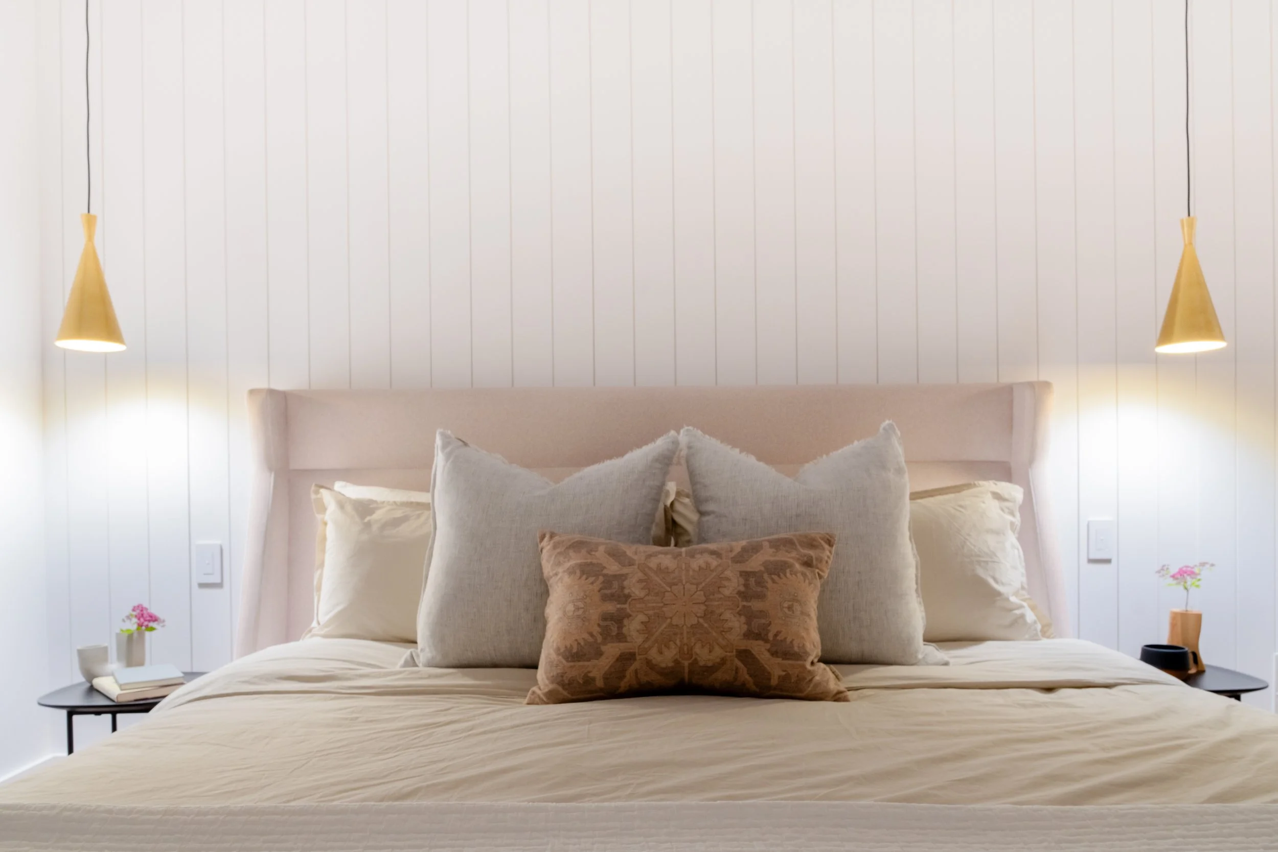
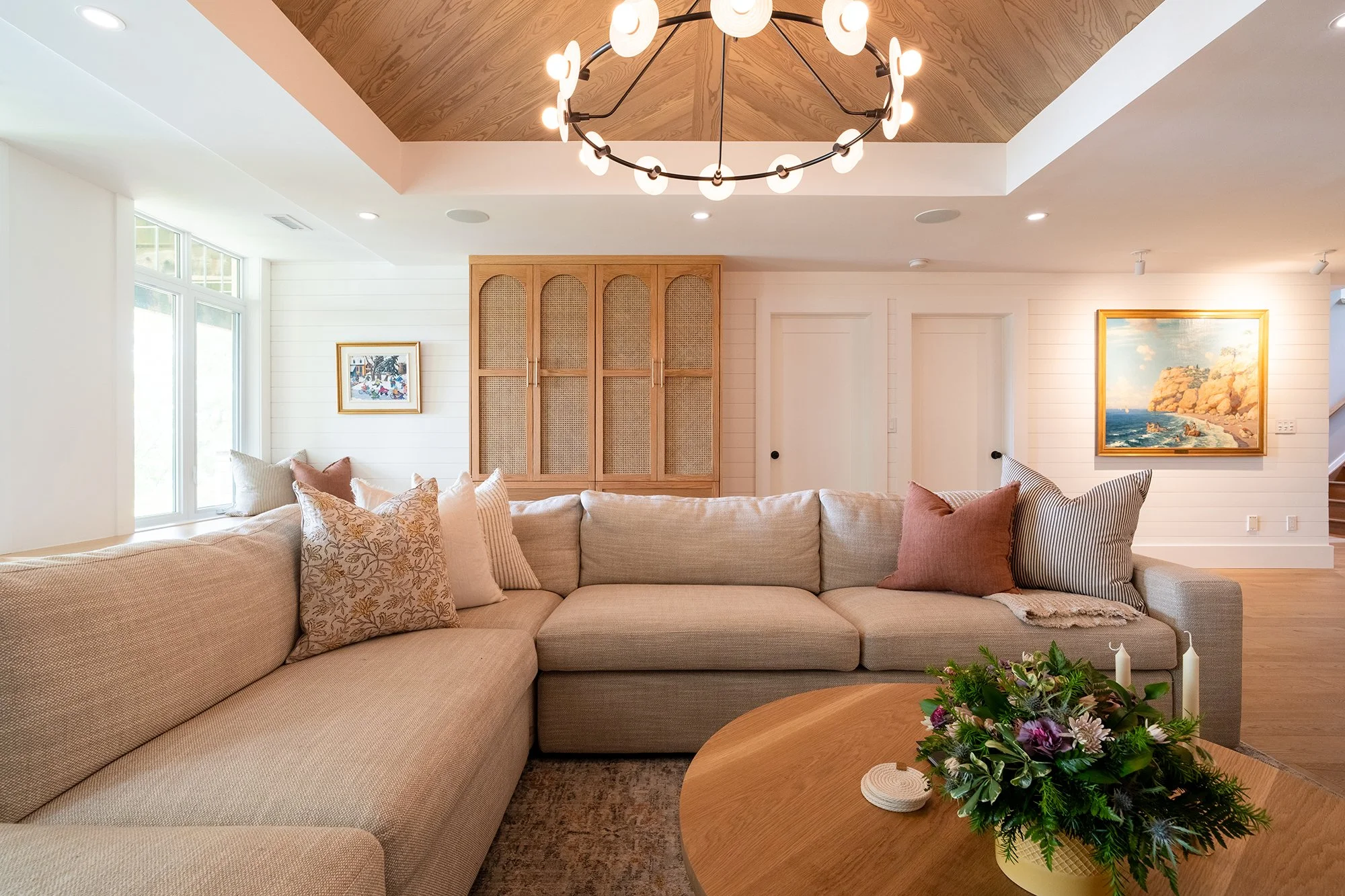
White shiplap along a walkout wall catches the natural light from outside, reflecting it back into the space and softening the lower level with a warm, inviting glow.
It’s also one of the most debated choices in interior design. A deceptively simple colour, white is anything but. Such a colour is layered with opinions, past experiences, and strong personal preferences. Choosing the “right” white can feel far more complicated than it should be.
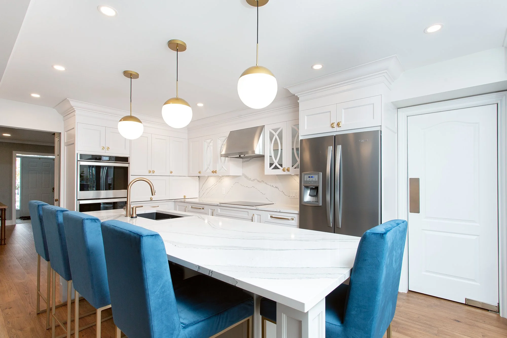
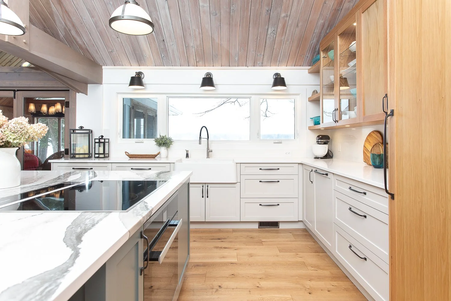
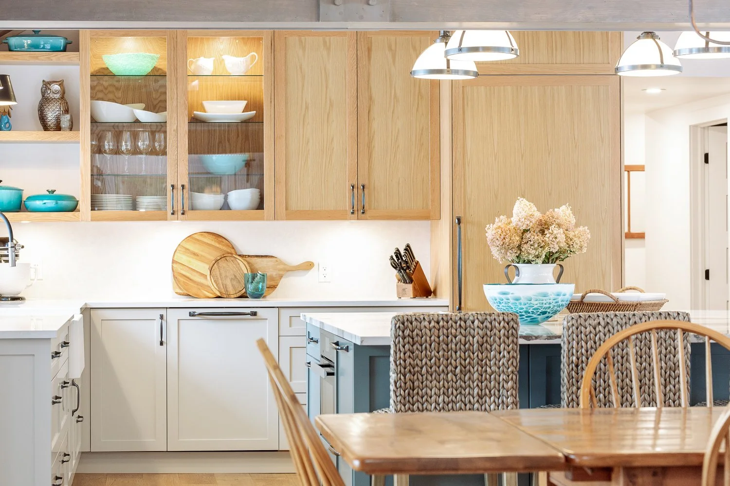
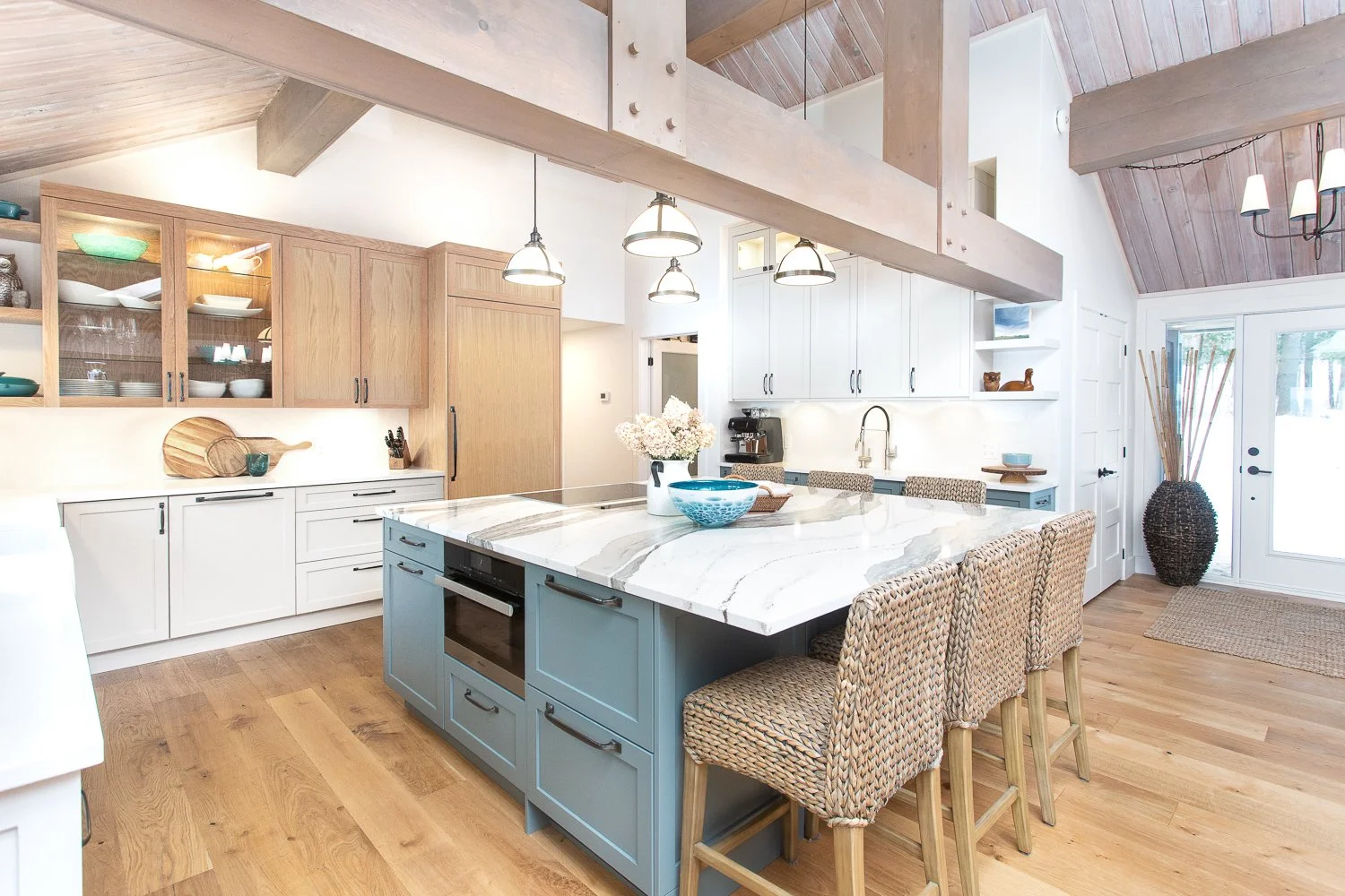
Our Lindsay project features Wevet White from Farrow & Ball. In contrast with blue accents it provides a contrast yet warm approach with stainless steel appliances.
In a time where colour-drenched spaces are having a moment, think painted trim, ceilings, and cabinetry included, it’s fair to wonder: where does white fit now? Has it been pushed to the bottom of the swatch deck, or does it still hold a place in our homes and design conversations?
The truth is, white isn’t going anywhere.
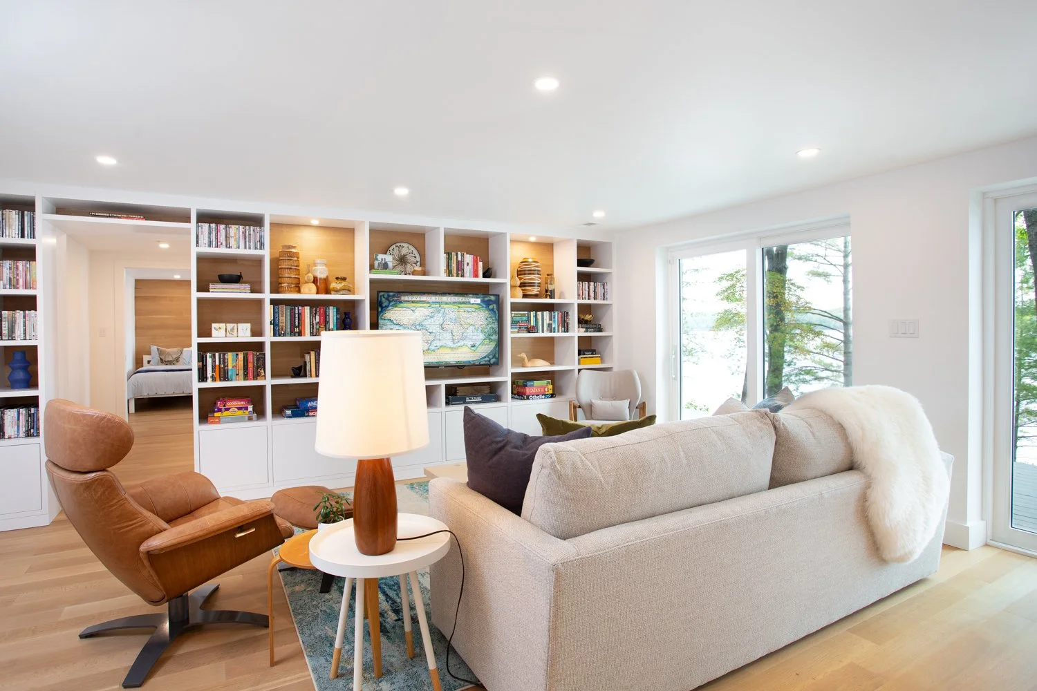
In our Gull Lake project, white appears warm against medium toned flooring and provides an airy backdrop to lake views.
It may not be the trend of the moment, but white has never really been about trends. It continues to hold its place in open, airy spaces. Spaces with natural light, higher ceilings, and a desire for clarity and calm. While we may be leaning into richer, more saturated tones in cozier rooms, white remains a foundational choice where lightness and openness are key.
And yes, white has a complicated reputation. If it were a friend, it might have been removed from the group chat years ago, misunderstood, occasionally difficult, and always a little controversial.
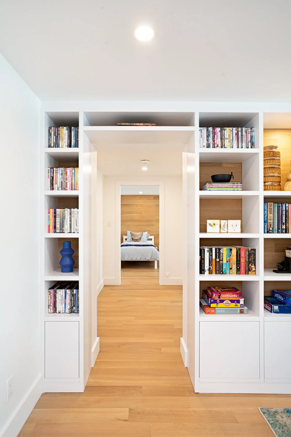
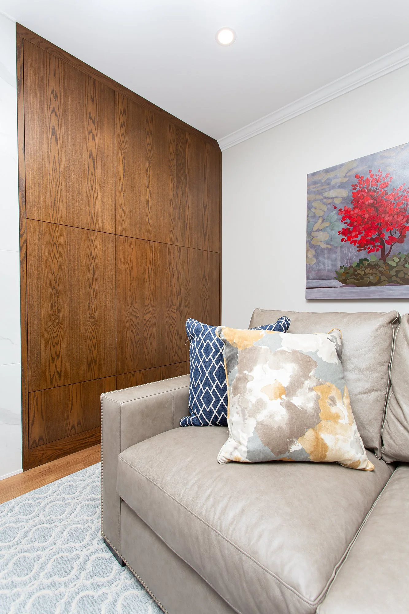
Always a win for shelving, white lets collections, colourful games and other collectables take centre stage.
So why do we keep coming back to it?
Because it works. Because it adapts. And because, despite everything, it continues to be one of the most requested colours in design. Just this week alone, I was asked twice: “What white should I use?”
So, let’s talk about it, yet again!
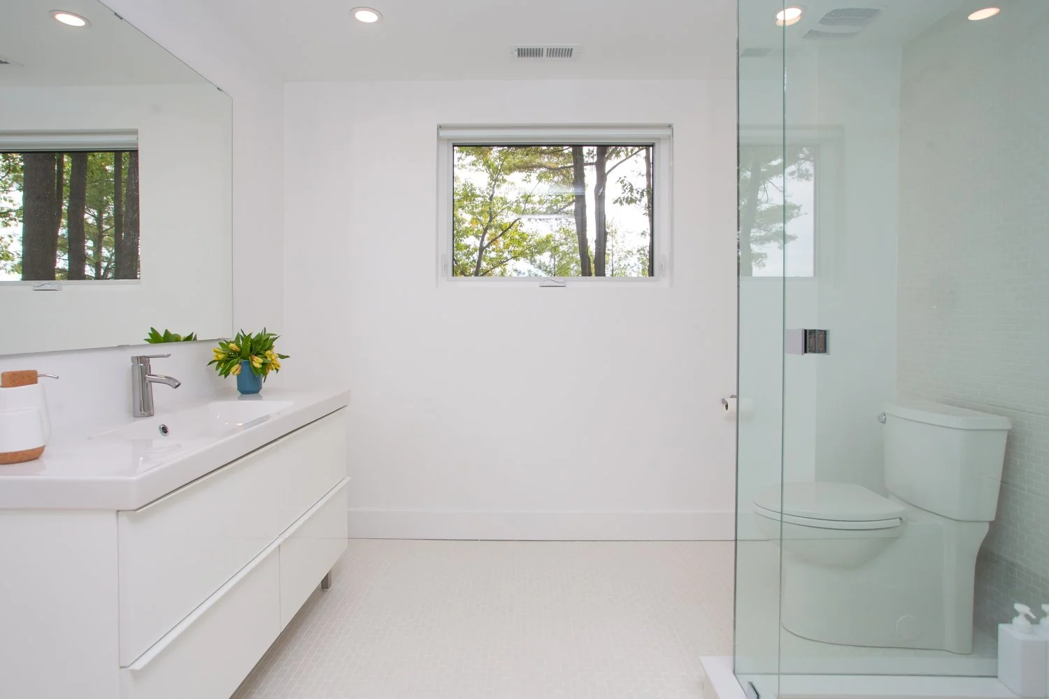
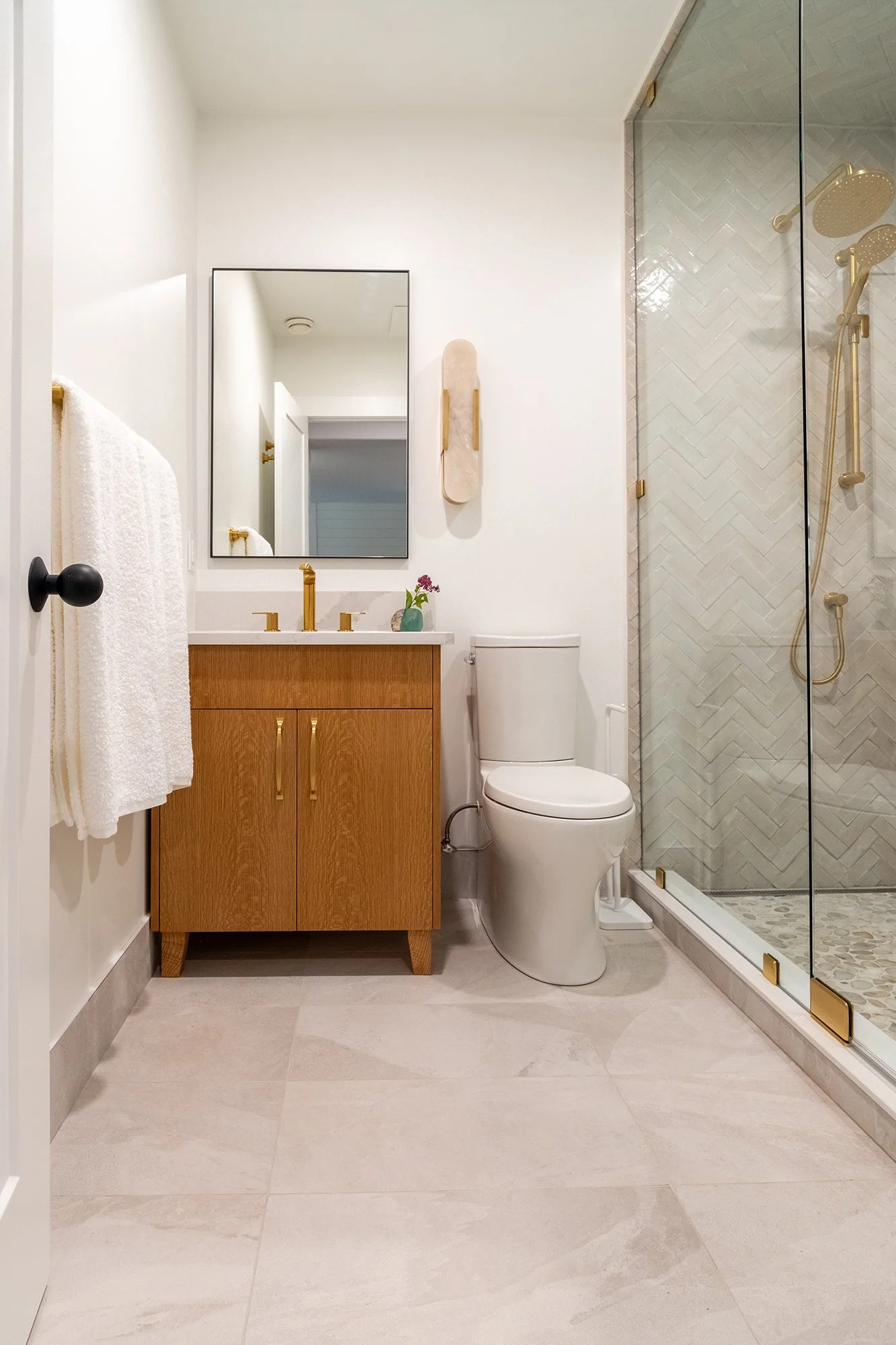
An all-white bathroom allows the view speak for itself!
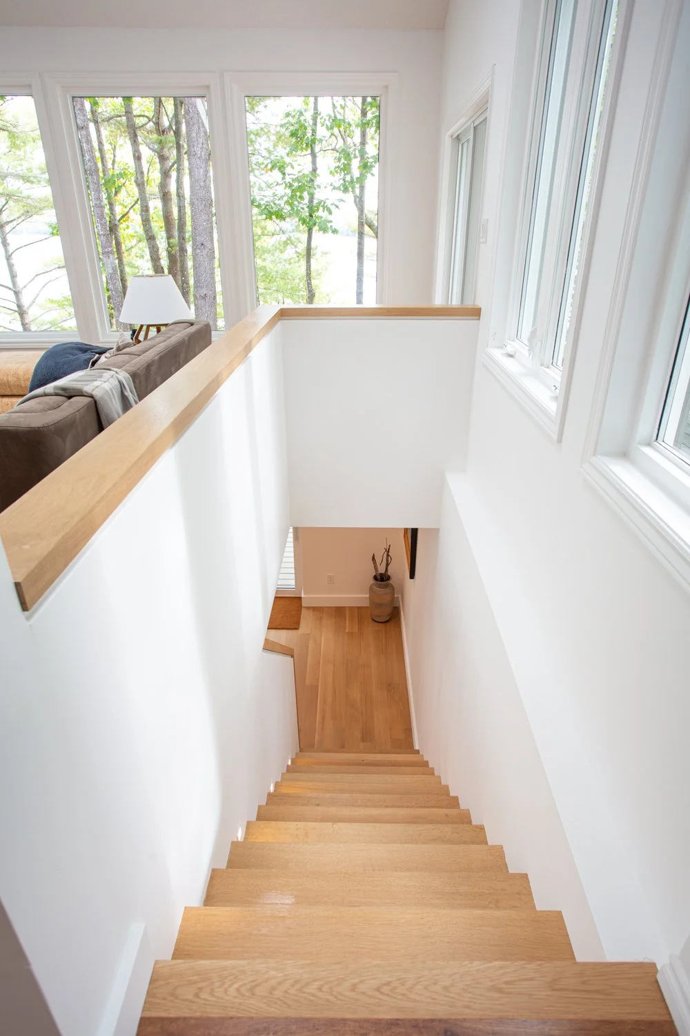
White has a way of letting bottom floor ceilings appear taller and more expansive.
Here’s a simple playbook to help make sense of white, and maybe even make the conversation a little easier.
Wevet by Farrow & Ball
A delicate white with a subtle touch of grey. This prevents a wide-open room from looking too institutional. It’s amazing how a touch of grey can soften and yet still create an airy, contemporary feel. It’s what Farrow & Ball refers to being part of the relaxed neutral family and works will in south-facing configurations.
Indian Point use of white allows different tones of wood to be the focal point.
Benjamin Moore Cloud White
This shade is probably the most widely used white and for good reason! It is a versatile off white known for its creamy and warm undertones. As a balanced shade that prevents a room from feeling cold. You will find this shade widely used on walls, trim, cabinets and ceilings.
Sherwin Williams Pure White
Another versatile option because it avoids looking to creamy or yellow. It still has a yellow undertone to provide a warm soft appearance. With its clean modern and high-quality finish, it’s a popular choice. Benjamin Moore also makes a Pure White option.
Benjamin Moore Simply White
The profile for this white makes it a “go-to” white. It’s brighter than White Dove and creamier than Chantilly Lace. If used in low light or on large surfaces, it’s yellow undertone may emerge. Ideal for modern or traditional spaces as it adds dimension and a welcoming glow.
Benjamin Moore Chantilly Lace
Chantilly Lace is renowned by designers and painters alike as being crisp and clean. It has minimal undertones and can be used for ceilings along with walls and trim. It elicits images of fresh cotton and white silk. It is also the brightest and most reflective of all the whites in the Benjamin Moore palette.
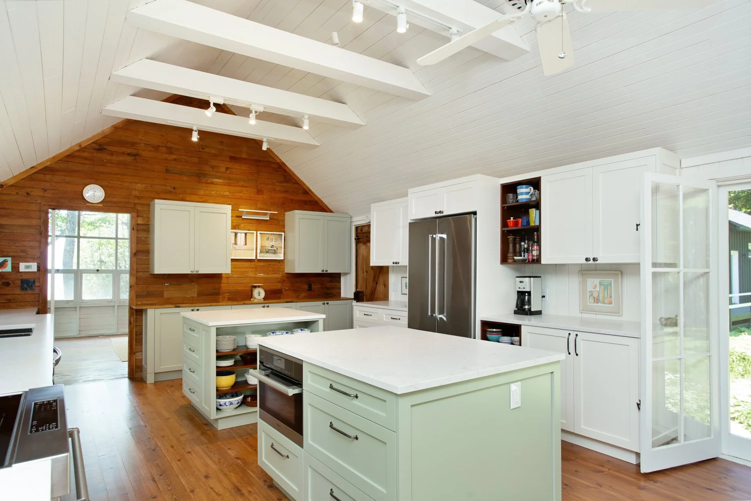
A historical family cottage on Sturgeon Lake gets a makeover with the white it deserves to freshen and provide a crisp frame for contrasting cabinetry and floors.
White is complicated, largely because of its undertones. Beneath the surface, whites can carry hints of blue, pink, yellow, green, or beige. And just to add to the mystery, those undertones shift depending on lighting and the surrounding décor.
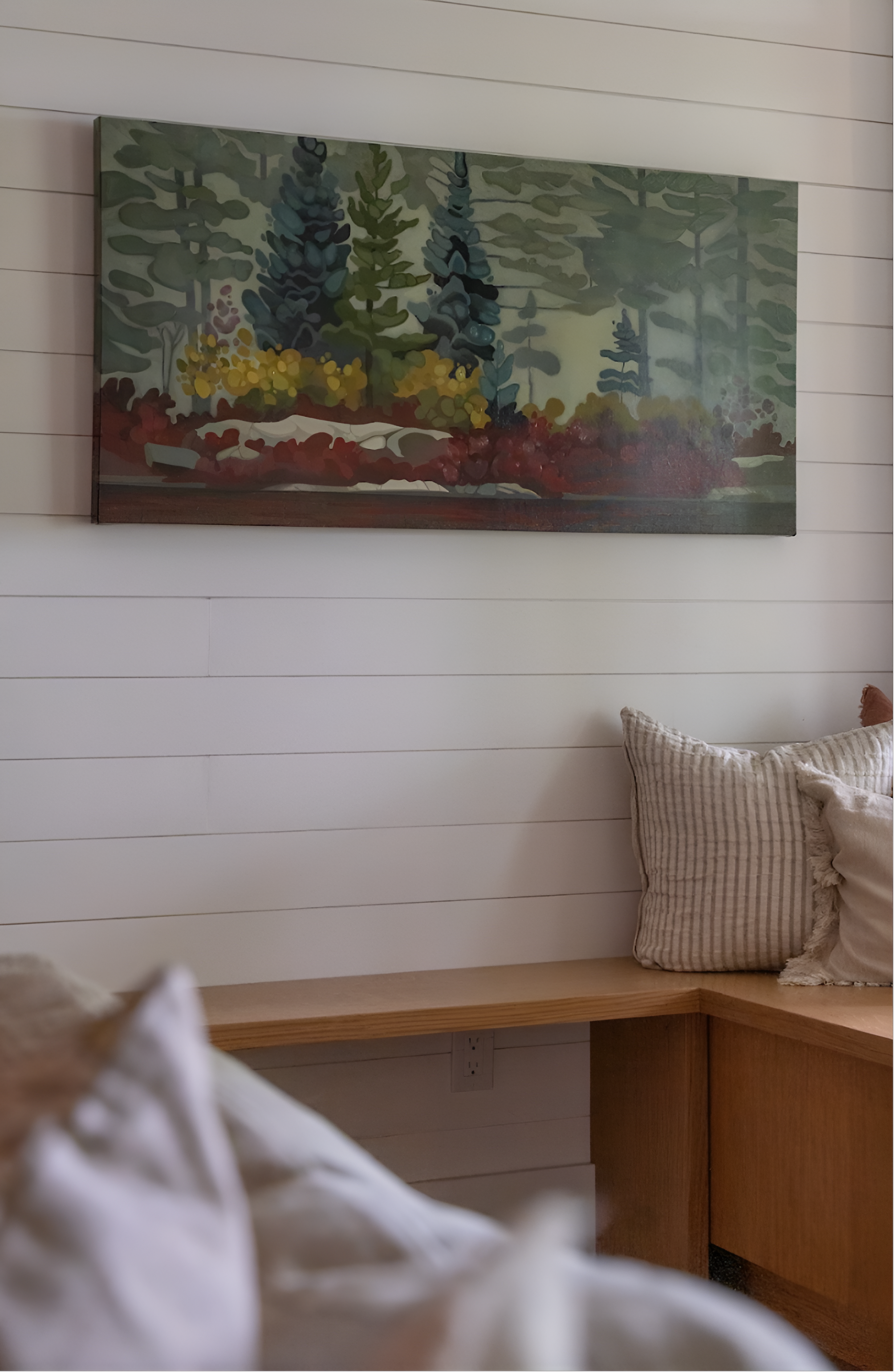
Shiplap in white is an ideal way to accent a guest room in a walkout area on Clear Lake. It provides interest and lets the lighting in this instance be the art.
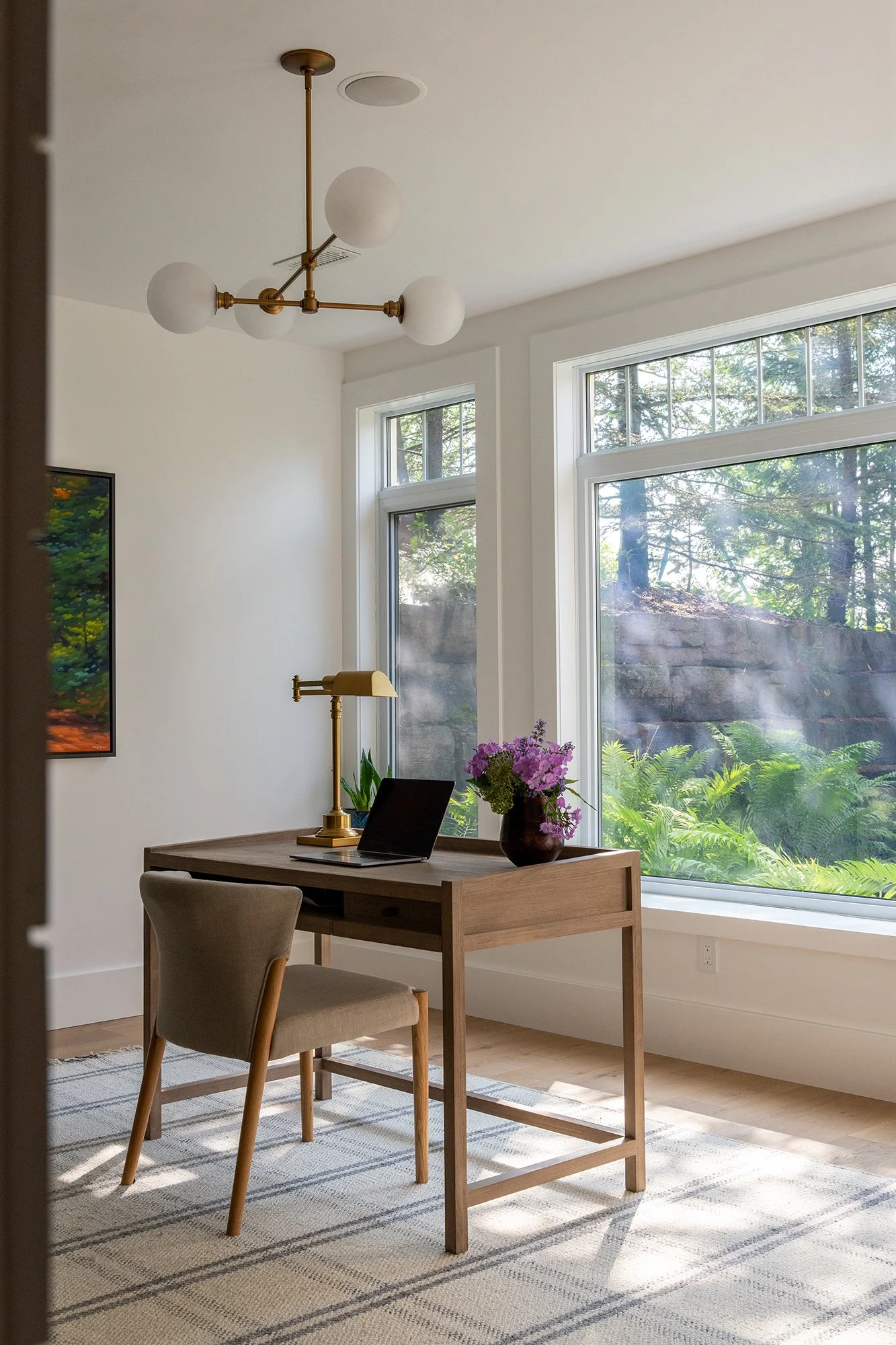
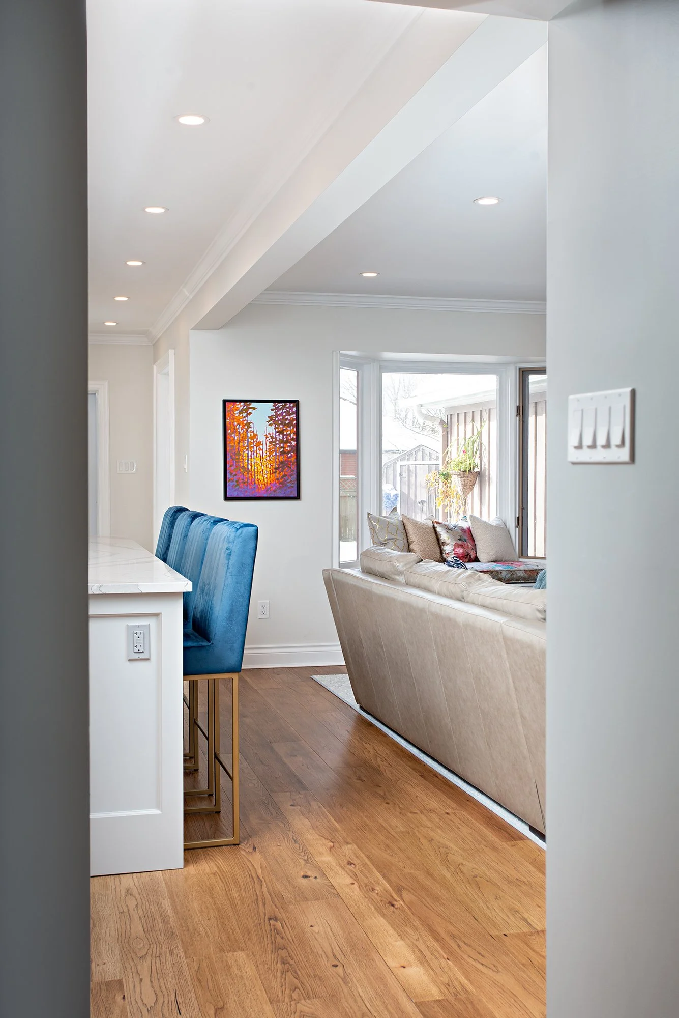
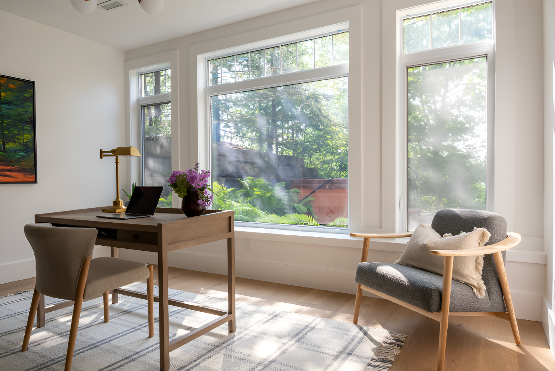
For an office space, white means a treasured piece of art can pop and the outdoors becomes seamless with the work area view.
So just when you think you’ve found the one, you realize not all whites are created equal. White behaves like a mirror, quietly reflecting everything around it. One of the simplest exercises I recommend to clients is to hold a paint swatch up against a piece of pure white paper, it immediately reveals the undertone. And yes, you’ve heard it before, but it’s worth repeating: always test your whites in different lighting conditions.
I love a powder room opportunity and this white backdrop opens the space up in concert with medium sized tile.
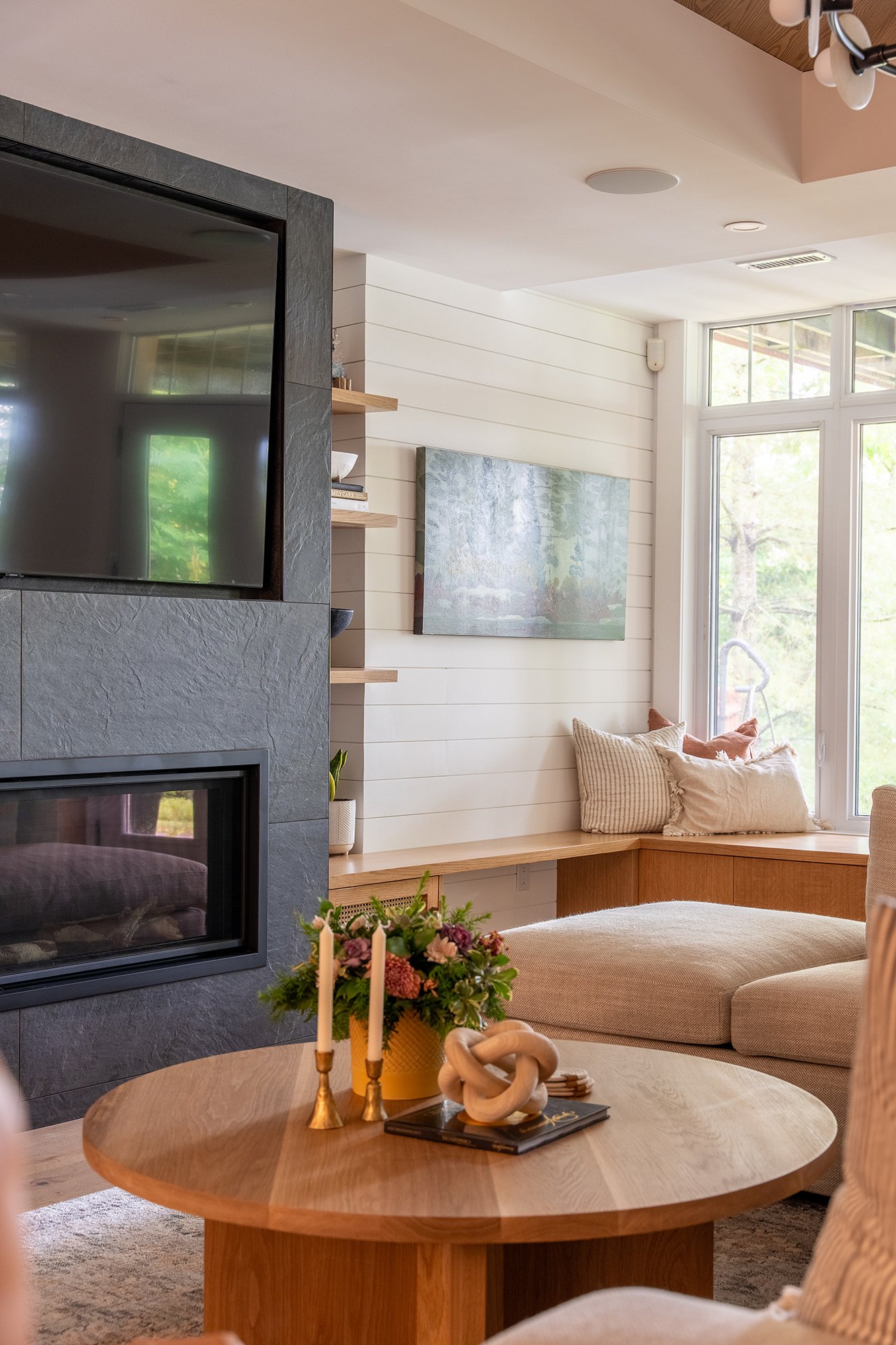
White helps frame a coffered ceiling in this Clear Lake walkout. It also plays up the natural light reflecting back into the long narrow room.
White can still be the colour of a marshmallow dessert, the tip of a meringue pie, or the underside of a wave just before it breaks. It’s the colour of detail and contrast, the backdrop that somehow still commands attention. It may seem simple, but it’s anything but. White enters the design conversation quietly… and then, as always, it gets complicated.
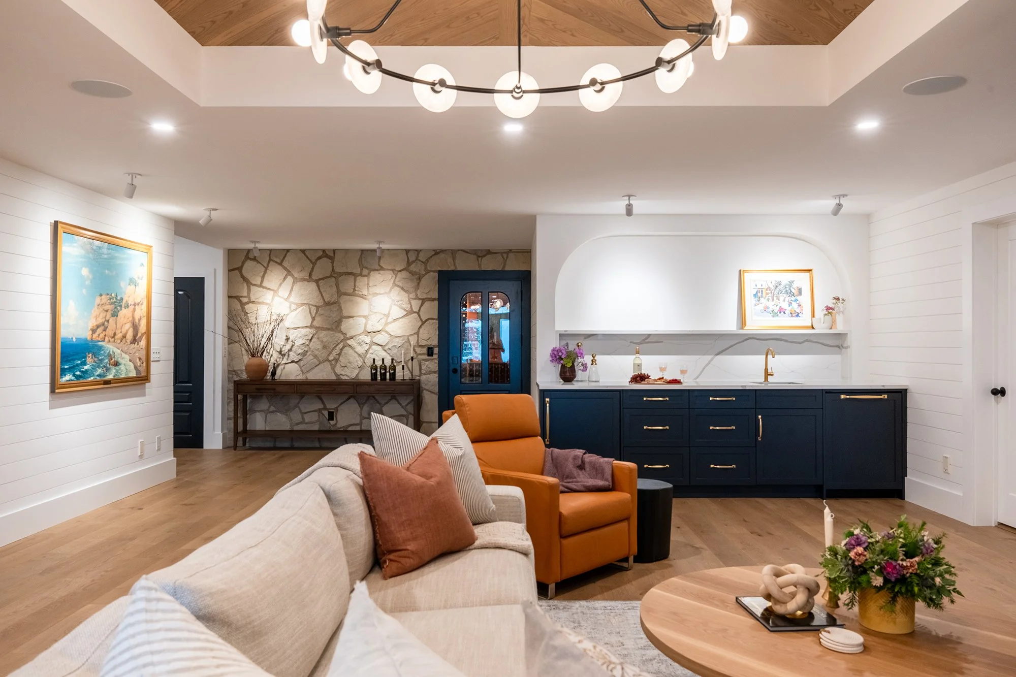
All White by Farrow and Ball was the perfect accent for the shiplap and kitchen walls in this Clear Lake walkout.
I’m always happy to help you sort through your whites, and everything else that comes with creating a space that feels just right!
For more blog stories on how we design for living see our post on Slow Design: The Intentional Home.
Learn more about our architectural design and other services: https://www.homebytc.ca/home#services
See our latest Project Portfolio full of architectural and interior design imagery:
https://www.homebytc.ca/projects
Sign up on our website for our monthly eNewsletter Lakeside Notes featuring all things art, culture and design. Stay current on what’s new in the design world, projects we are working on, the Grove Theatre, events and art exhibitions.
Tim + Chris